Simplicity. No better way to start my samples than with a photo of my granddaughter, Camille. Keep the photo simple. Can you tell what is the subject? Too busy a background that interferes with the subject? Does it convey an emotion? Analyze what you see and decide on the strongest point-of-interest. Camille!
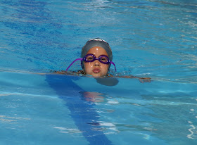
My friend here makes a great subject. You have to love 'em. Strong subject that everyone will recognize as soon as they see the photo. Since the background is blurry, it tends to draw more attention to the subject. Most people who have automatic cameras may not be able to change the aperature on their camera to cause the background to blur, but if shooting a close object, usually a background far enough away will automatically be blurred.
Clutter? Don't think you will find any in this photo. The strongest point-of-interest in this photo is the flower, so why not make it the subject. No one can mistake your intentions and the fact that the background is out-of-focus adds to the interest.
If you are going to show a subject which is in motion, make sure that you have the motion coming into the photo as opposed to having the subject going out of the photo. Keep the viewer interested in every aspect of the photograph.
I guess you can tell what the subject is in this photo. It's OK to fill the frame if you have a strong enough subject, but not necessary to do that to have an interesting photograph.

You will see in the next series of photos how to decide where to place the subject, but you still need to make the subject the item your viewer will go to first in the photo. Can you tell what the subject is below. Watch that you don't confuse the viewer with too many items in the photo, but you can still add elements in the photo to add interest to your subject as I did here with the paper under the subject of the glasses.
Placement of the Subject is extremely important. If a viewer cannot tell what the subject is in the photo it will lose the viewer's interest. The following eight photos will show you ways to place the subject in your photograph.You don't always have to place the subject in the middle. Use the "Rule of Thirds" I described yesterday to help in the placement of the subject. Here the subject is in the bottom right, looking into the photo.
The subject was placed at the bottom right for a reason in this photo. It is heading into the photo and placed in the bottom right for make it more visually pleasing.
Notice how the "Rule of Thirds" is used to help draw the subjects into the photo. Try not to lead a viewer out of the photo.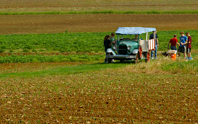
The "Rule of Thirds" was used to place the subject in this photo. The circular leading lines of the water and wet sand also help guide you to the extremely simple subject.
The "Rule of Thirds" was used to draw interest from a overly-busy photo to the subject which is looking into the photo.
You can see how "leading lines" can 'drag' you into this subject. No doubt about what the subject is in this photo.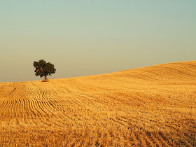
Try not to put the horizon line dead-center in the photo. It usually makes for an uninteresting photo. Here the sky out-weighs the foreground. Watch that you don't divide a photo vertically with a telephone pole, tree, etc. for the same reasons.
This photo has the horizon line in the middle of the photo. Sometimes it can break your photo into two separate units, making the photo uninteresting. Is that the case for this photo, you be the judge.
The next two photos are example of balance within a photograph. The first shows formal balance and can be used to illicit feelings of dignity and repose but does make for a very static photograph. What is on the left is on the right. Not many subjects fit into this category.
This is a good example of non-symmetrical balance. It is a less informal type of balance and good for almost any type of photograph. Large subject on the right, small object on the left.
The next eight photos illustrate different types of "Movement into the frame." Diagonal and vertical lines abound in this photo. They all tend to lead you to the windows of the Central Market building. Vertical lines are good for showing rigidity and strength.

Here diagonal leading lines help you toward the water. The tree in the left foreground adds some depth to the photo.
The vertical/diagonal lines of the menu lead you to the subject in this photo. The fact that the objects in the rear are slightly out-of-focus help keep your attention on the scrumptious croissants.

Another good example of the "S" curve. You pick up the road in the foreground and follow it throughout the photo. Make sure that you try to end the curve inside the photo so you don't lead the viewer directly out of the photo.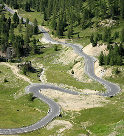
Circular lines help make this an interesting photo. Your eye follows the woman's hair toward the hand and the cigarette as do the lines of the elbow to the hand. Making photos black and white can also help make photos interesting. Color sometimes will make the photo so busy that you don't see the reason that the photo was taken.
The circular lines of the dish draw your attention toward the meal as do the flow of the fingers reaching into the meal.
These circular lines which engulf the subjects keep the movement of the photo right where you want it, in the center of the pix.
The next two photos illustrate 'Perspective'. By adding something in the foreground as a frame for the photo, you can add the illusion of a third dimension, depth. In the first I have added the tree on the left and the overhanging branches, as well as the trunk help to give the photo a 3D feeling. In the second, the people in the water are framed by the overhanging palm tree.


My friend here makes a great subject. You have to love 'em. Strong subject that everyone will recognize as soon as they see the photo. Since the background is blurry, it tends to draw more attention to the subject. Most people who have automatic cameras may not be able to change the aperature on their camera to cause the background to blur, but if shooting a close object, usually a background far enough away will automatically be blurred.

Clutter? Don't think you will find any in this photo. The strongest point-of-interest in this photo is the flower, so why not make it the subject. No one can mistake your intentions and the fact that the background is out-of-focus adds to the interest.

If you are going to show a subject which is in motion, make sure that you have the motion coming into the photo as opposed to having the subject going out of the photo. Keep the viewer interested in every aspect of the photograph.

I guess you can tell what the subject is in this photo. It's OK to fill the frame if you have a strong enough subject, but not necessary to do that to have an interesting photograph.

You will see in the next series of photos how to decide where to place the subject, but you still need to make the subject the item your viewer will go to first in the photo. Can you tell what the subject is below. Watch that you don't confuse the viewer with too many items in the photo, but you can still add elements in the photo to add interest to your subject as I did here with the paper under the subject of the glasses.

Placement of the Subject is extremely important. If a viewer cannot tell what the subject is in the photo it will lose the viewer's interest. The following eight photos will show you ways to place the subject in your photograph.You don't always have to place the subject in the middle. Use the "Rule of Thirds" I described yesterday to help in the placement of the subject. Here the subject is in the bottom right, looking into the photo.

The subject was placed at the bottom right for a reason in this photo. It is heading into the photo and placed in the bottom right for make it more visually pleasing.

Notice how the "Rule of Thirds" is used to help draw the subjects into the photo. Try not to lead a viewer out of the photo.

The "Rule of Thirds" was used to place the subject in this photo. The circular leading lines of the water and wet sand also help guide you to the extremely simple subject.


You can see how "leading lines" can 'drag' you into this subject. No doubt about what the subject is in this photo.

Try not to put the horizon line dead-center in the photo. It usually makes for an uninteresting photo. Here the sky out-weighs the foreground. Watch that you don't divide a photo vertically with a telephone pole, tree, etc. for the same reasons.

This photo has the horizon line in the middle of the photo. Sometimes it can break your photo into two separate units, making the photo uninteresting. Is that the case for this photo, you be the judge.

The next two photos are example of balance within a photograph. The first shows formal balance and can be used to illicit feelings of dignity and repose but does make for a very static photograph. What is on the left is on the right. Not many subjects fit into this category.

This is a good example of non-symmetrical balance. It is a less informal type of balance and good for almost any type of photograph. Large subject on the right, small object on the left.

The next eight photos illustrate different types of "Movement into the frame." Diagonal and vertical lines abound in this photo. They all tend to lead you to the windows of the Central Market building. Vertical lines are good for showing rigidity and strength.

Here diagonal leading lines help you toward the water. The tree in the left foreground adds some depth to the photo.

The vertical/diagonal lines of the menu lead you to the subject in this photo. The fact that the objects in the rear are slightly out-of-focus help keep your attention on the scrumptious croissants.

Here is an example of an "S" curve. Your eyes tend to follow the road into the photo which winds it's way from front to back, stopping in the rear of the pix.

Another good example of the "S" curve. You pick up the road in the foreground and follow it throughout the photo. Make sure that you try to end the curve inside the photo so you don't lead the viewer directly out of the photo.

Circular lines help make this an interesting photo. Your eye follows the woman's hair toward the hand and the cigarette as do the lines of the elbow to the hand. Making photos black and white can also help make photos interesting. Color sometimes will make the photo so busy that you don't see the reason that the photo was taken.

The circular lines of the dish draw your attention toward the meal as do the flow of the fingers reaching into the meal.

These circular lines which engulf the subjects keep the movement of the photo right where you want it, in the center of the pix.

The next two photos illustrate 'Perspective'. By adding something in the foreground as a frame for the photo, you can add the illusion of a third dimension, depth. In the first I have added the tree on the left and the overhanging branches, as well as the trunk help to give the photo a 3D feeling. In the second, the people in the water are framed by the overhanging palm tree.


Wow! Gives me a lot to think about rather than just "point and shoot". Quality rather than quantity, right? You know me though; good pics happen more by accident!!! Always love yours. JS
ReplyDelete