1. Simplicity. Keep the photo simple. You don't have to show your entire vacation in one photo. Pick a subject for the photo and make sure you convey that subject to your viewer. Look long and hard at the subject until you are aware of every single aspect and detail. Analyze what you see and decide on the strongest point on interest and how you can make this feature prominent. A cluttered photo distracts the eye and takes away from the subject, so avoid busy backgrounds where the subject may get lost.
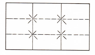
2. Placement of the subject. Watch out for mergers. Object mergers are items which may sprout from your subject. A telephone pole coming out of a head is amusing, but not what you want in a great photo. Some one's ear sprouting a chair or an animal's tail is the same idea. Border mergers are items in the border of your photo which interfere with the subject. The rear end of a car speeding out of your photo of the bride and groom at your relative's wedding isn't going to make it into their scrapbook. There is one main guideline for determining the placement of the subject, orcenter-of-interest in a photo. It is called the "Golden Section" or "rule-of-thirds." Imagine looking at your viewing screen or looking into your viewfinder and dividing it both horizontally and diagonally w
 ith two parallel lines. The intersection of these lines create natural points for subject placement. If you feel your subject is strong enough to be placed in the center of the photo, then place it there. When taking landscapes and cityscapes watch that the horizon line isn't always placed in the center of the photo as well as be careful you don't split the photo in half vertically by placing subjects like tall trees or poles in the center.
3. Balance. This guideline is listed by everyone who writes about composition, so I put it in my book when I composed it. Still not sure how much of a guideline to composition it is, but it certainly will help you decide what type of balance to use in certain situations. Symmetrical or formal balance is when you place the same or similar items on each side of the photo. Formal balance can be used to illicit feelings of dignity and depose, but does make for a very static photograph. Non-symmetrical balance or informal balance is placing unequal objects on either side of the photo. This tends to make a more interesting photograph and my personal opinion is that you will use this more than the symmetrical balance.
4. Movement into the frame. Movement can be accomplished by four basic line forms. Vertical, horizontal, diagonal and the "S" curve. Vertical line photos show strength, rigidity and solidarity while horizontal line photos, such as landscapes represent peacefulness and tranquility. The diagonal line represents action or movement and can create a feeling of action. The "S" curve tends to draw a viewer into a frame, but you need to be careful not to take the viewer right back out of the photo. Spiral or circular lines are variations of the "S" curve and helps guide your viewer around and to the subject. Remember, you still should make the subject easy to determine. These four basic line forms can be used as leading lines to draw your viewer in the photo. Whether they are graceful curves or dynamic diagonals, all lines should lead the viewer's eye to the focal point or subject. I will have samples in my story tomorrow for you to see.
5. Perspective. This refers to the illusion of a third dimension in a photograph. We see in length, width and depth, but creating this effect on a flat piece of photo paper or on your computer screen is difficult. Framing usually helps to add the depth dimension. An overhanging tree branch, an opening in a cement block that you shoot through, photographing through an open doorway, or shooting through grass or weeds can create the illusion of depth.
Learn to pre-visualize your photograph. As you look through the viewfinder or on the viewing screen at the rear of your camera, imagine what the result will be when you press the button or shutter release on your camera and then process and download the image or make the print. Remember again, some "snapshots" may turn out to have good composition, but most good photographs are created. Tomorrow you will see plenty of samples that my help you create that fantastic vacation photo. It was another extraordinary day in the life of an ordinary guy.

No comments:
Post a Comment